
12/06/2026




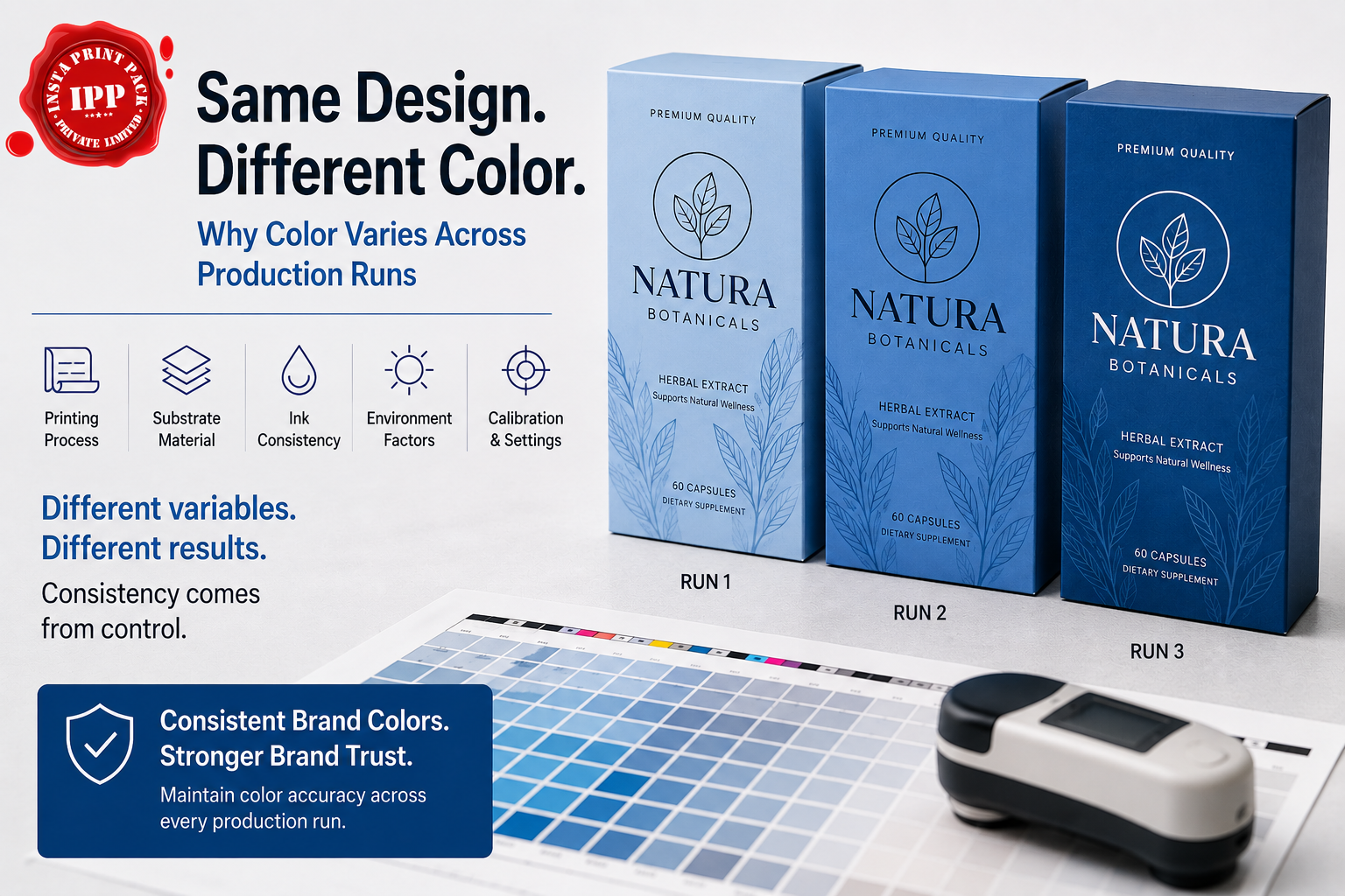
Imagine launching a new product, approving every packaging detail, and successfully getting it onto retail shelves. A few months later, you reorder the exact same packaging using the same artwork files, same brand guidelines, and the same approved colors.
But when the new batch arrives, something looks different.
The logo appears slightly darker. The background shade doesn't quite match the previous run. Side-by-side, the packaging no longer looks identical.
For many brands, this can be frustrating, especially when no design changes were made.
What most businesses don't realize is that color consistency in packaging is influenced by far more than the artwork itself. Printing methods, substrates, finishing processes, and production conditions can all affect how colors appear on the final product.
As brands grow across multiple SKUs, packaging formats, and production runs, these variations can become a serious branding & packaging challenge. Inconsistent packaging not only affects shelf appeal but can also impact brand recognition, customer trust, and the professional image brands work hard to build.
Understanding why these differences occur is the first step toward maintaining packaging consistency across every production run.
Because print color is influenced by much more than the artwork itself.
Even when CMYK values remain unchanged, the final appearance can vary due to:
The file may be identical, but the printed result can still look different.
Many businesses believe color consistency is controlled entirely by the design file.
However, professional printing involves multiple variables working together.
For example:
A brand may specify:
C70 M35 Y0 K0
in its artwork.
Yet that same color can appear slightly different when printed through:
This happens because each process reproduces color differently.
The result is:
Same artwork. Same values. Different visual color.
Understanding the causes is the first step toward maintaining consistent branding & packaging.
Different printing technologies reproduce color differently.
For example:
Known for excellent color accuracy and consistency across larger production runs.
Offers flexibility and shorter runs but may produce slightly different color characteristics.
Widely used for labels and flexible packaging but behaves differently than offset printing.
Each process interprets color in its own way.
The material being printed on has a major impact on final color appearance.
Colors printed on:
will often look different even when using identical artwork.
Material texture, absorbency, and surface finish all affect color reproduction.
Different ink systems interact with substrates differently.
Ink density, drying conditions, and curing methods can influence how colors appear after production.
Packaging often includes:
These finishing processes can alter the perceived color significantly.
Many companies initially view color variation as a printing issue.
In reality, it is often a brand consistency issue.
Consumers rarely understand printing processes.
They only notice when products look different.
Imagine a customer purchasing the same product from two different retailers.
If the packaging colors appear noticeably different, customers may question:
This can weaken brand trust.
Strong branding & packaging depends on delivering a consistent visual experience across every customer touchpoint.
As businesses scale, packaging complexity increases.
This creates more opportunities for inconsistency.
Brands often expand into:
Maintaining color consistency across multiple SKUs becomes increasingly challenging.
As demand grows, brands require frequent reorders.
Without proper color controls, slight variations can accumulate between production batches.
A brand may use:
Maintaining a consistent appearance across every format requires careful color management.
Using different suppliers can introduce additional color variations if production standards are not aligned.
Today's consumers make decisions quickly.
Packaging often creates the first impression.
Consistent product packaging helps brands achieve:
Products appear unified and professional.
Customers immediately recognize the brand regardless of product variation.
Consistency reinforces confidence in product quality.
A uniform packaging experience strengthens long-term loyalty.
Maintaining consistency requires more than good design.
It requires structured production processes.
Best practices include:
Establishing approved color references for every brand element.
Reviewing physical proofs before full production begins.
Monitoring color performance throughout production.
Using appropriate materials to minimize color variation.
Maintaining standardized workflows across packaging programs.
At Insta Print Pack, color consistency is treated as an essential part of the packaging process, not an afterthought.
IPP provides integrated custom packaging solutions that help brands maintain consistency across production runs, packaging formats, and product lines.
Through professional commercial printing capabilities, brands receive reliable color reproduction across packaging applications.
IPP produces custom printed packaging designed to maintain visual consistency while supporting business growth.
Labels often create the most visible customer touchpoint.
Professional custom label printing helps maintain consistency across products and packaging formats.
From folding cartons to specialty packaging, IPP supports brands with packaging systems designed around consistency, quality, and brand standards.
IPP's services extend beyond printing to include branding and packaging solutions that help brands create a unified visual identity across every product line.
As brands expand into multiple channels, regions, and product categories, packaging consistency becomes increasingly important.
Consumers expect the same experience whether they purchase:
The brands that maintain visual consistency across every touchpoint are often the brands that build stronger trust and recognition over time.
Color consistency is one of the most overlooked challenges in packaging production.
While the design file may remain unchanged, factors such as printing methods, materials, inks, and finishing processes can all influence the final result.
For growing brands, these variations can quickly become a branding & packaging issue rather than simply a printing issue.
Maintaining consistency requires the right processes, the right expertise, and the right packaging partner.
By combining custom packaging, custom label printing, commercial printing, and integrated branding support, Insta Print Pack helps brands create packaging that looks consistent, professional, and recognizable across every production run. For more information, Contact Us.
Because color appearance is influenced by printing methods, substrates, inks, coatings, and production conditions, not just the design file.
No. Different printing processes and materials can produce different visual results even when CMYK values remain identical.
Consistent colors improve brand recognition, strengthen customer trust, and create a more professional product presentation.
Different materials and printing methods used for labels, cartons, and packaging can change how colors appear.
Through professional commercial printing, custom printed packaging, custom label printing, folding carton manufacturing, and branding & packaging solutions designed to maintain consistency across production runs.