
01/01/2026


Color consistency is one of the biggest challenges in commercial printing. A brochure that looks perfect on screen can appear dull, darker, or completely different once printed. For businesses, this is more than a visual issue, it affects brand identity, credibility, and printing costs.
Whether it’s flyers, brochures, catalogs, or corporate stationery, color mismatch is a common problem that delays projects and leads to reprints. Understanding why this happens, and how professional printers handle it, helps businesses avoid unnecessary losses.
Q.1 Is color mismatch a frequent problem in commercial printing projects?
Yes, color mismatch is one of the most common issues in commercial printing, especially when files are not prepared or processed correctly.
Color matching in commercial printing is not as simple as pressing “print.” Multiple variables influence how ink appears on paper, and even a small change in one factor can alter the final output.
Screens display colors using light, while printing uses ink on physical surfaces. This fundamental difference is the main reason printed colors rarely look exactly like what you see on a monitor.
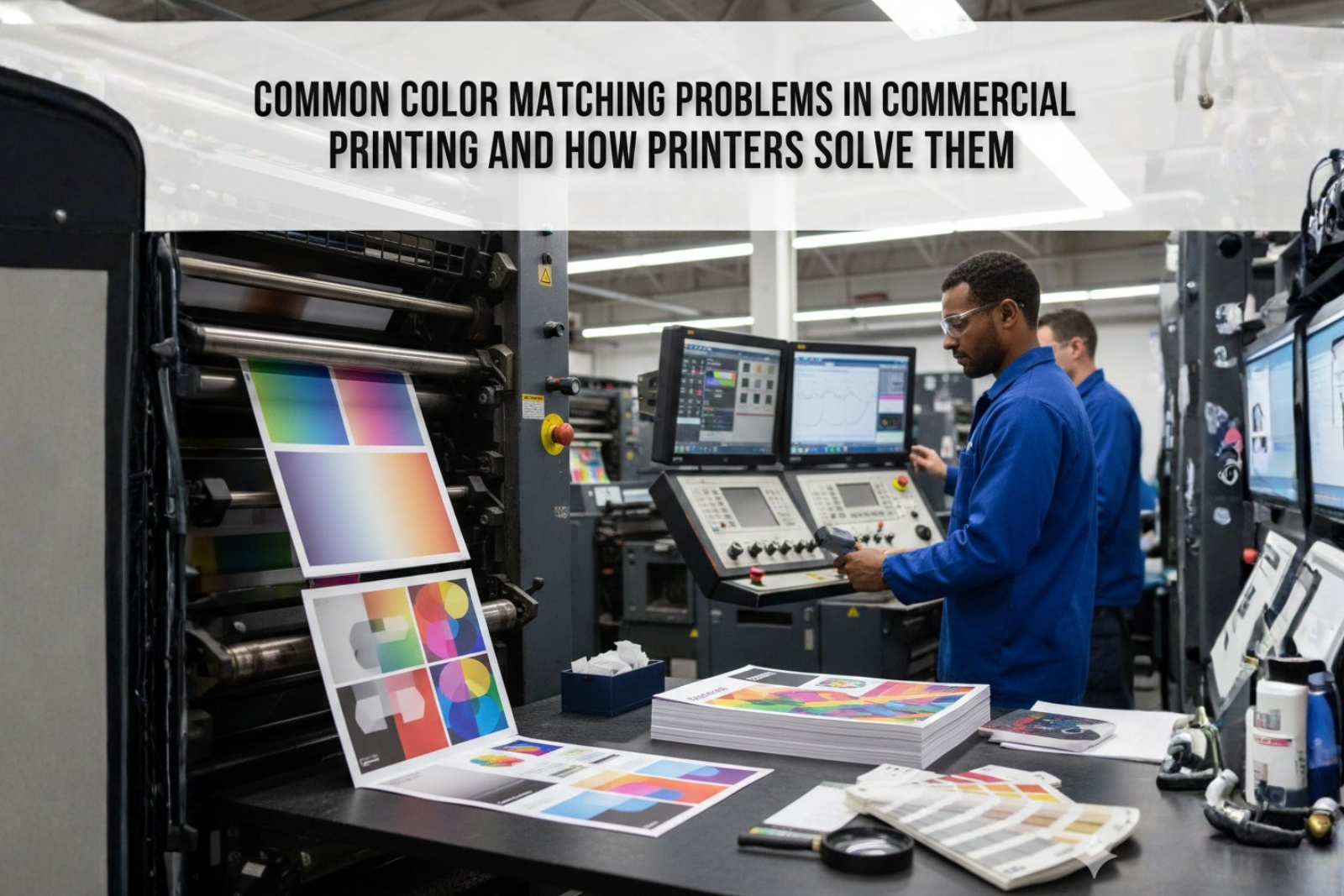
Most Common Color Matching Problems in Commercial Printing
Design files are often created in RGB mode because screens use red, green, and blue light to display colors. Printing presses, however, rely on CMYK inks.
When RGB files are converted to CMYK:
Without proper conversion, even high-quality commercial printing cannot reproduce the intended color accurately.
Paper is never truly white. Different stocks reflect ink differently, which affects color perception.
For example:
This is especially noticeable in flyer and leaflet printing, where budget paper choices can significantly impact color output.
Ink behavior changes based on paper texture and coating. Excessive ink absorption can make colors appear dull, while insufficient ink coverage results in uneven tones.
Inconsistent ink density often occurs when:
Printing machines must be calibrated regularly. Even small deviations in press settings can lead to visible color differences across print runs.
This issue is common when:
Professional printers offering offset printing services invest heavily in routine calibration to maintain consistency.
Colors look different under various lighting conditions. A print viewed under warm indoor lighting may appear different in daylight.
This phenomenon, known as metamerism, is often misunderstood and leads to false assumptions of printing errors.
Experienced commercial printing providers begin with strict prepress controls. This includes:
These steps ensure files are optimized before reaching the press.
Printers regularly calibrate machines to control:
Both offset and digital printing solutions require different calibration approaches, and professionals adjust settings accordingly.
Printers adjust ink values based on the paper type being used. A design printed on coated stock will require different settings than the same design printed on uncoated paper.
This adjustment is crucial for maintaining color consistency across different print materials.
Digital proofs are helpful, but physical proofs remain the most reliable way to evaluate color accuracy.
Professional printers often recommend:
This practice significantly reduces reprint risks.
Offset printing services are known for consistent color reproduction over large volumes, making them ideal for corporate printing services such as catalogs and brochures.
Digital printing solutions offer faster turnaround but may show slight color variation between batches. Choosing the right method depends on volume, timeline, and color sensitivity.
Businesses play a key role in avoiding color problems. Some practical steps include:
Clear communication between the brand and printer helps set realistic expectations.
Consistent color output builds brand recognition. Over time, poor color management leads to:
Reliable commercial printing processes protect brand integrity and reduce operational waste.
Color matching issues in commercial printing usually happen because of file preparation errors, paper differences, and press calibration gaps. These problems can affect brand consistency and lead to delays or reprints if not handled correctly. Understanding how colors behave from screen to print helps businesses set realistic expectations and avoid costly mistakes.
Experienced printers solve these challenges through proper color management, material-specific adjustments, and physical proofing before final production. By working closely with a reliable commercial printing partner and following print-ready best practices, businesses can achieve consistent color results and protect their brand across all printed materials. Contact Us for more information.
Screens use light (RGB), while printing uses ink (CMYK), which naturally produces color differences.
Yes, coated and uncoated papers absorb ink differently, impacting color brightness and contrast.
Exact matching cannot be guaranteed, but professional printers achieve very close consistency using proofs and calibration.
Offset printing generally provides better consistency for large volumes compared to digital printing.
Using print-ready files, approving physical proofs, and choosing experienced printers significantly reduce reprint risks.